Widget SDK
The Widget SDK is a small JavaScript library that you embed directly in your website. It provides builders for rendering a payment button that opens the Vipps MobilePay app on mobile devices and a payment dialog on desktop devices, as shown below.
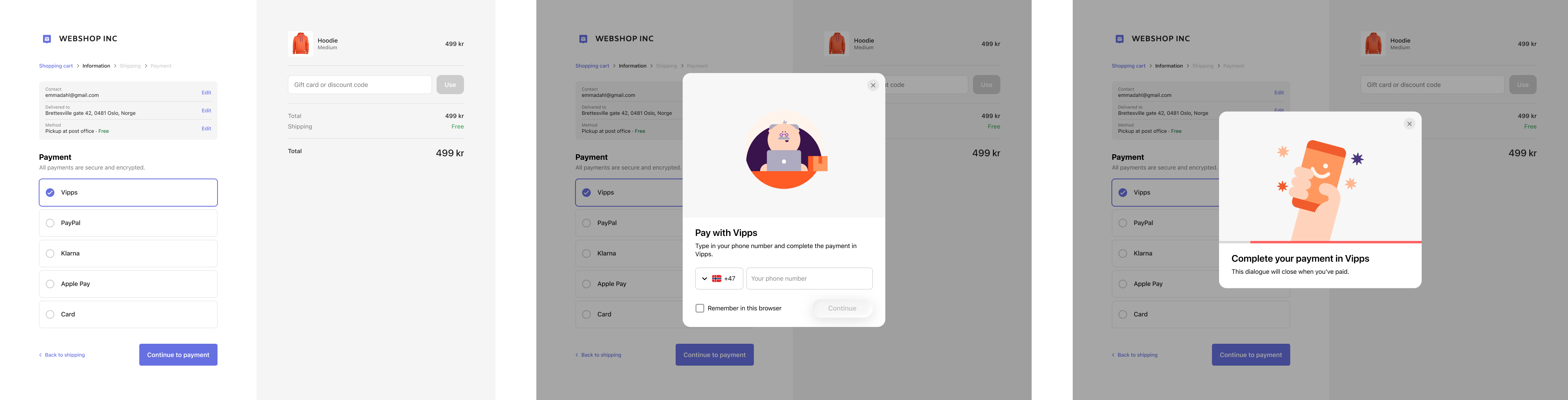
Screenshots showing the flow: 1. The merchant's checkout page with Vipps selected as the payment method. The dialog is not yet open. 2. A dialog showing a phone number entry form. The checkout page is visible and dimmed behind the dialog. 3. A dialog prompting the customer to open the Vipps app to complete the payment.
The button's appearance is served by the SDK, ensuring it always reflects the current Vipps MobilePay design guidelines and the correct brand for your market.
In the Danish and Finnish markets: By using the Widget SDK, the new change in brand from MobilePay to Vipps will automatically happen for you.

 In the Danish and Finnish markets: By using the Widget SDK, the
Is this right for you?
Use the Widget SDK on a website, or in an app that uses a WebView. It shows an on-brand button and starts the payment for you: it opens the Vipps MobilePay app on mobile and tablet, or a payment dialog on desktop.
To show only the button and start the payment yourself, use the Button generator. For a native app, download the static buttons from the brand guidelines.
Installation
Include the Widget SDK script on your page. The SDK exposes a global window.vipps object.
<script src="https://cdn.vippsmobilepay.com/js/widget-sdk/vipps-widget.js" data-vipps-widget-sdk></script>
The data-vipps-widget-sdk attribute is recommended. It helps the SDK find its own script tag later, when it needs to inject styles or load the button component.
If your site uses a strict Content Security Policy, see Content security policy below.
Building with an AI assistant? Install our AI tools plugin so it answers from the current Widget SDK documentation.
Quick start
Start a desktop host on the top-level page, then add a payment trigger:
vipps.host().start();

vipps
  .trigger(async () => {
    const { paymentUrl } = await fetch("/api/create-session").then((r) => r.json());
    return paymentUrl;
  })
  .button()
  .mount("#pay-button");
Calling .button() on the trigger returns a pre-wired payment button. Clicking it asks the top-level host to open a desktop payment dialog; if no host accepts the request, it falls back to a full-page redirect. On mobile and tablet, it redirects directly. On success or cancel, the SDK automatically closes the dialog and redirects the page.
Modal close behavior
By default, the desktop modal close button cancels the payment. This is the recommended behavior for most integrations.
If you want customers to close only the modal and keep the payment active, pass cancelPaymentOnClose: false:
vipps
  .trigger(createSession, {
    cancelPaymentOnClose: false,
  })
  .button()
  .mount("#pay-button");
With this option, the modal close button only closes the modal. A cancel action from inside the payment iframe still cancels the payment.
Use the "close" event if you need custom handling when the modal is closed without canceling the payment:
vipps
  .trigger(createSession, {
    cancelPaymentOnClose: false,
  })
  .on("close", () => {
    // The modal has been closed. Add custom cleanup, analytics,
    // or UI updates here.
  })
  .button()
  .mount("#pay-button");
The SDK closes the modal before calling your "close" handler. The payment remains active, and your handler only reacts to the closed modal.
Custom event handling
Override the default success or cancel behavior by chaining .on() before .button():
vipps
  .trigger(async () => {
    const { paymentUrl } = await fetch("/api/create-session").then((r) => r.json());
    return paymentUrl;
  })
  .on("success", (close, redirectUrl) => {
    close();
    analytics.track("payment_success");
    window.location.href = redirectUrl ?? "/thank-you";
  })
  .on("cancel", (close) => {
    close();
  })
  .button()
  .mount("#pay-button");
Branding
Switch between Vipps and MobilePay by calling .brand() on the button:
vipps.trigger(createSession).button().brand("mobilepay").mount("#pay-button");
Trigger API
The trigger builder starts a Vipps/MobilePay payment flow. On desktop, it asks the top-level host to open a modal dialog; on mobile and tablet, it redirects directly to the payment page.
By default, the trigger automatically closes and redirects the page when a success or cancel event is received. Call .on() to override either default.
The builder accepts a resolver function that returns (or resolves to) the payment URL. The resolver is called each time .open() is invoked, so a fresh session URL is fetched on every attempt. The builder returns a TriggerHandlerBuilder interface:
| Method / Property | Description |
|---|---|
.on(event, callback) | Override the callback for "success" or "cancel", or react to "close" when cancelPaymentOnClose is false. |
.button() | Return a VippsButtonBuilder pre-wired to this trigger. Clicking the button calls .open() automatically. |
.open() | Start the trigger. Calls the resolver to get the payment URL, then asks the host to show the modal (desktop) or redirects (mobile/tablet). |
.close() | Programmatically close the trigger. |
.isOpen | Read-only boolean indicating whether the trigger is currently open. |
Desktop behavior
On desktop, the top-level host renders a modal <dialog> with an embedded <iframe> pointing to the payment URL. The dialog supports:
- A close button in the top-right corner
- Dynamic resizing based on messages from the iframe content
If the embedding page's CSP refuses to frame the payment page, the host closes the dialog and the trigger redirects the full page to the same payment URL.
Mobile behavior
On mobile and tablet devices, the trigger redirects the current page to the payment URL instead of opening a modal. Event callbacks registered with .on() do not fire on mobile — the customer is redirected to the URL provided at session creation.
Host API
Use the Host API on the top-level page that should display desktop payment dialogs. Without a host, desktop triggers fall back to a full-page redirect. This applies to hosted desktop triggers, including triggers running inside embedded iframes.
The host owns desktop dialog hosting only. Mobile and tablet payment launch should stay in the user's click flow and should not be delegated through postMessage.
Start a desktop host on the top-level page:
const host = vipps.host();
host.start();
The host opens payment URLs in the same desktop dialog used by normal triggers, and forwards success, cancel, close, or error responses back to the requesting frame.
For security, the host only accepts requests from your own page and the frames it embeds, and it only opens an approved Vipps/MobilePay payment page in the dialog. The merchant-return redirect after checkout is unaffected.
| Method / Property | Description |
|---|---|
vipps.host() | Create a desktop host. |
host.start() | Start listening for child-frame trigger requests. |
host.stop() | Stop listening for child-frame trigger requests. |
Button API
The button builder creates and mounts Vipps/MobilePay payment buttons into the DOM. Most integrations should use trigger.button() (see Quick start above) rather than creating a standalone button.
The SDK renders a lightweight placeholder button immediately, then upgrades it to the full <vipps-mobilepay-button> web component once the component definition is registered. This ensures the button is visible before the web component scripts finish loading.
Standalone usage
vipps
  .button()
  .brand("vipps")
  .mount("#pay-button-container")
  .triggers(async () => {
    // Handle payment initiation
  });
API
The builder returns a chainable VippsButtonBuilder interface:
| Method | Description |
|---|---|
.brand(value) | Set the brand — "vipps" or "mobilepay". |
.language(value) | Set the language — "no", "en", "da", "fi", or "sv". Defaults to the user's preferred language. |
.verb(value) | Set the call to action — "pay", "login", "register", "continue", "confirm", "donate", "express", or "buy". Defaults to "pay". |
.variant(value) | Set the color variant — "primary", "dark", or "light". Defaults to "primary". |
.type(value) | Set the button type — "button" or "submit". Defaults to "button". |
.branded(value) | Toggle the brand logo inside the label. Defaults to true. |
.compact(value) | Toggle the compact (logo-only) layout. Defaults to false. |
.rounded(value) | Toggle fully rounded corners. Defaults to true. |
.stretched(value) | Toggle full-width (stretched) layout. Defaults to false. |
.continueAsFirstName(name) | Set the name shown by the "continue" verb (e.g. "Continue as Ada"). |
.mount(selector) | Mount button(s) into all elements matching the CSS selector. |
.triggers(target) | Connect the button to a trigger target. Clicks call .open(). |
.onclick(handler) | Register an additional click handler. The handler can be sync or async. |
.rerender() | Re-mount the button at the previously used selector. |
.unmount() | Remove the button(s) from the DOM and detach event listeners. |
.toElement() | Return the raw button HTMLElement without mounting it. |
All presentation methods are chainable and can be called before or after .mount(). For example:
vipps
  .trigger(createSession)
  .button()
  .brand("mobilepay")
  .verb("express")
  .variant("dark")
  .stretched(true)
  .mount("#pay-button");
Content security policy
The Widget SDK script is served from our CDN and updated continuously without prior notice.
Because the script contents change, do not pin the script with a hashed CSP source (script-src 'sha256-…') or a Subresource Integrity (integrity) attribute. Any update on our side changes the hash and breaks the button for your customers.
Allowlist our origins by host instead:
Content-Security-Policy:
  script-src https://cdn.vippsmobilepay.com;
  frame-src https://pay.vipps.no https://api.vipps.no https://pay.mobilepay.dk https://pay.mobilepay.fi;
  font-src https://designsystem.vippsmobilepay.com;
Keep your own sources, such as 'self', alongside these. You only need the payment domains for the markets you sell in.
The font-src entry covers the brand fonts used by the button when it renders as a web component on the page, which is what happens on mobile and tablet.
In the test environment, use the test domains instead:
Content-Security-Policy:
  script-src https://cdn.vippsmobilepay.com;
  frame-src https://pay-mt.vipps.no https://apitest.vipps.no https://pay-mt.mobilepay.dk https://pay-mt.mobilepay.fi;
  font-src https://designsystem.vippsmobilepay.com;
See Landing page servers for the full list of production and test domains.
Nonce-based policies
If your site uses a nonce-based Content Security Policy (CSP), add the same server-generated nonce to both:
- The
Content-Security-Policyresponse header. - The Widget SDK script tag.
Your server should create a new nonce for each page load. Do not hardcode it. The Widget SDK reads the nonce from its script tag and reuses it for the styles and scripts it adds to the page.
<script
  src="https://cdn.vippsmobilepay.com/js/widget-sdk/vipps-widget.js"
  nonce="{server-generated-nonce}"
  data-vipps-widget-sdk
></script>
Example CSP header, with the frame-src sources from above left out for brevity:
Content-Security-Policy:
  script-src 'self' 'nonce-{server-generated-nonce}' https://cdn.vippsmobilepay.com;
  style-src 'self' 'nonce-{server-generated-nonce}';
The SDK adds its styles as inline <style> elements rather than loading an external stylesheet, so the nonce is all style-src needs.
The important part is that the same nonce appears in the CSP header and on the Widget SDK script tag.
If your site does not use nonce-based CSP, you do not need to add a nonce just for the Widget SDK.
Framing the payment and button pages
The desktop dialog and the branded button are iframes on the payment domain for your market, for example https://pay.vipps.no or https://pay.mobilepay.dk. Allow that domain in frame-src to get them.
If your policy blocks it, the SDK degrades instead of failing:
- The payment dialog closes and the page redirects to the payment URL, so the payment still completes.
- The button renders as an on-page
<vipps-mobilepay-button>web component instead of an iframe.
Cookie consent and GDPR
The Widget SDK itself stores nothing on the visitor's device: no cookies, no localStorage or sessionStorage, no fingerprinting, no analytics. The vipps-widget.js bundle is strictly necessary for the payment the visitor is about to start, so it can load without prior consent.
There are two consent-relevant behaviors, both living on the Vipps origin:
- Remember me: greeting returning customers with "Continue as ***123", meaning the
continueverb and.continueAsFirstName(...)personalization, and the remembered number the payment page reads. Recognizing the customer across merchants, through the shared.vipps.nocookie, is a distinct and stronger step that is strictly opt-in. It runs only when you passrememberMe: true. - Analytics: usage tracking on the payment page.
Both are convenience or measurement features, not strictly necessary for the payment, so under ePrivacy and GDPR they typically require the visitor's prior consent.
| What | Purpose | Basis |
|---|---|---|
| Payment / session state (Vipps origin) | Process the payment the user starts | Strictly necessary — exempt |
| Remembered number ("Continue as …") | Convenience for returning customers | Consent required |
Cross-site remember me (.vipps.no) | Recognize the customer everywhere | Opt-in (rememberMe: true) |
| Analytics | Usage measurement | Consent required |
You, the merchant, are the data controller for your site and should reflect the above in your own cookie policy.
The consent-required behaviors in the table are on until you call vipps.consent(). That default preserves the behavior of integrations built before the consent API existed; it is not a statement that consent is unnecessary. To gate them, call vipps.consent() with the visitor's choices before you mount the button, as shown below.
Bind your cookie consent screen to the widget
Map your consent tool's state onto a single call to vipps.consent(). Pass any subset of categories. An unset category keeps its default, meaning on-page personalization and analytics stay allowed, except cross-site remember me, which stays off until you explicitly pass rememberMe: true:
vipps.consent({ rememberMe: true, analytics: true }); // visitor accepted: both allowed
vipps.consent({ rememberMe: false, analytics: false }); // declined or withdrawn: both suppressed
vipps.consent({ analytics: false }); // decline analytics only, remember me unchanged
The call is reactive. Call it again whenever consent changes, and mounted desktop buttons re-render immediately, switching between the plain button and "Continue as …", with no page reload. On mobile, the current consent is applied to the payment redirect at tap time.
For a compliant flow, start in the safe state before mounting the button, then update when the visitor decides:
// Before mount: nothing consent-gated runs until the visitor opts in.
vipps.consent({ rememberMe: false, analytics: false });
vipps.trigger(createSession).button().mount("#pay-button");

// Later, from your cookie banner:
onAccept(() => vipps.consent({ rememberMe: true, analytics: true }));
onWithdraw(() => vipps.consent({ rememberMe: false, analytics: false }));
The SDK is vendor-agnostic, so wire it to whichever consent tool you use. A few examples:
// OneTrust: map each widget category to your OneTrust groups,
// for example C0003 functional and C0002 analytics.
window.addEventListener("OneTrustGroupsUpdated", () => {
  vipps.consent({
    rememberMe: OnetrustActiveGroups.includes("C0003"),
    analytics: OnetrustActiveGroups.includes("C0002"),
  });
});

// Cookiebot:
window.addEventListener("CookiebotOnConsentReady", () => {
  vipps.consent({
    rememberMe: Cookiebot.consent.preferences,
    analytics: Cookiebot.consent.statistics,
  });
});

// IAB TCF (v2): Purpose 1 "store/access information on a device",
// Purpose 8 "measure performance".
__tcfapi("addEventListener", 2, (data, ok) => {
  const decided = data.eventStatus === "tcloaded" || data.eventStatus === "useractioncomplete";
  if (ok && decided) {
    vipps.consent({
      rememberMe: !!data.purpose?.consents?.[1],
      analytics: !!data.purpose?.consents?.[8],
    });
  }
});
Until vipps.consent() is called, the SDK preserves its historic behavior for on-page personalization and analytics, both on, so existing integrations are unaffected. Cross-site remember me is the exception: it is opt-in and stays off until you call vipps.consent({ rememberMe: true }).